

Apple Explore: Encouraging Exploration
UX/UI Design
Overview: In this project, I designed a new feature for Apple Maps that encourages users to wander and explore without a set destination. Inspired by the idea that not all journeys need a fixed endpoint, "Explore Mode" invites users to “get lost” on purpose, supporting spontaneous discovery through a seamless integration into Apple’s existing UI. The goal was to create an intuitive and playful experience that feels native to Apple Maps while shifting the user’s mindset from efficiency to curiosity.
Responsibilities: I worked on this project from start to finish, starting with user research to better understand how people explore new places and what might encourage them to wander. I created user personas and scenarios to ground the design in real behaviors and needs, then sketched out ideas through paper prototypes to get a feel for the flow and experience. From there, I built wireframes and user flows, constantly refining based on feedback from usability testing. Finally, I wrapped it all up with a high-fidelity prototype.
Timeline: 3 weeks
Tools: Figma
Research & Ideation
Stage 1.1: Interviews & Analysis
During my interviews, I aimed to discover what made getting lost rewarding, why users would want to do so, and when they decide they are finished wandering. I conducted three interviews using the following questions:
• Can you recall a time you got lost? How did you get lost? How did you feel while you were lost?
• Have you ever intentionally wandered without a destination? In such a scenario, when do you choose to stop wandering? Is there a cue or cue(s) that prompted you to stop?
• How often do you use navigational software day to day?
• What are your main concerns when exploring without navigation software?
• What are some things that may encourage you to want to explore?
• What are some likes and dislikes you have about Apple Maps? (if they don’t use Apple Maps, other navigational software)
From my results, I found:
People use navigation apps as a way to:
• Guide them from place to place
• Help them discover new places to explore nearby
• Plan out places to go at a given location & time taken to get there
• Prevent getting lost or going toward danger
• Find the fastest route to get to a destination
• Meet new people & stay connected with friends
What encourages people to explore:
• Lots of options/places around to visit (e.g. mall)
• Meeting new people
• Traveling & sightseeing
• Health reasons
• Games that encourage exploration & exercise
• Learning about the unknown
• New experiences
• Making new memories
• Collecting souvenirs
What causes people to stop exploring/wandering:
• Boredom
• Fear/Anxiety (of what is ahead or of what has been discovered)
Final analyses that I focused on:
• People feel more comfortable and confident exploring when they know they are safe and not “lost” in an unfamiliar, unknown environment (in which case they feel fear)
• ⅔ interviewees explored in malls, which are designed to be explored, where you know how you can safely leave and there is always guidance available when you do want navigation.
• ⅓ explored in the unknown with no safety backup measures, and ended up feeling fear and regretting the experience.
• Fear of the unknown & exploration with risk comes with a slight thrill, which may be why some people choose to do so. At the same time, there should be an emphasis on safety.
• People explore when they know they have an abundance of time. When they have an upcoming appointment/curfew/plans, they are much more wary of time management and appreciate the estimated time that navigation apps provide.
• People like exploring when it comes with some type of reward (meeting new people, seeing beautiful sights, souvenirs, game achievements, cool experiences, etc.)
Stage 1.2: User Persona
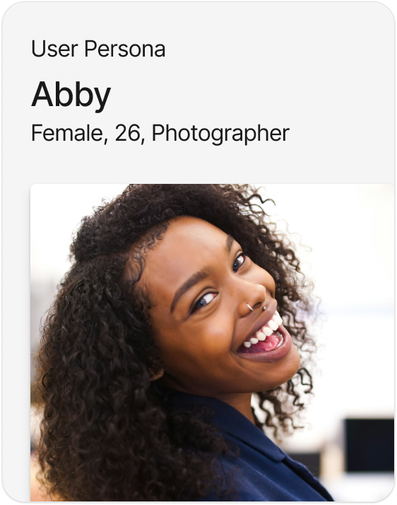
Abby is a photographer who thrives on finding beauty in mundane, everyday life. She often explores new places, especially when traveling for shoots or just wandering through her home city. Abby gets sidetracked often when following a route on Apple Maps. She loves meeting and talking to new people, taking pictures of views of cool spots, and trying local food when heading to a destination. However, when she is feeling unsafe or is under a time crunch, she sticks to the fastest route on Apple Maps.
Goals & Motivations:
• Discover new, beautiful, or interesting places to photograph.
• Create meaningful memories through spontaneous experiences.
• Explore as many places as she can
• Staying safe and confident while venturing into new places.
• Create meaningful memories through spontaneous experiences.
• Explore as many places as she can
• Staying safe and confident while venturing into new places.
Frustrations:
• When map apps overcorrect or try to reroute her constantly.
• Limited features that support open-ended wandering.
• Feeling rushed when she doesn’t have enough time to explore properly.
• Limited features that support open-ended wandering.
• Feeling rushed when she doesn’t have enough time to explore properly.
User Scenario
It’s Saturday, and Abby has a relatively free schedule, so she grabs her camera and decides to explore a part of the city she’s never really checked out before. She doesn’t really have a set destination in mind, but she’s feeling a burst of creativity to take some pictures. So, she opens Apple Maps and switches to “Wander Mode,” which immediately shows her spots around her that she can explore. She visits an alley with cool street art, a quiet park she’s never had the chance to check out, and a coffee shop with a cozy atmosphere. Instead of a strict route, the app lets her choose her path. As she explores, Abby takes photos of whatever grabs her attention. The app records the places she visits and the route she forges for herself, so she can always turn around and find her way back. After a couple of hours, Abby is satisfied with her adventure. She opens the app and sees a map of where she’s been and the route she took. She saves the route and takes notes for future reference. She heads home feeling inspired and much more connected to her city.
Stage 1.3: Project Proposals
With my research results and user persona in mind, I drafted up three ideas that could potentially encourage exploration:

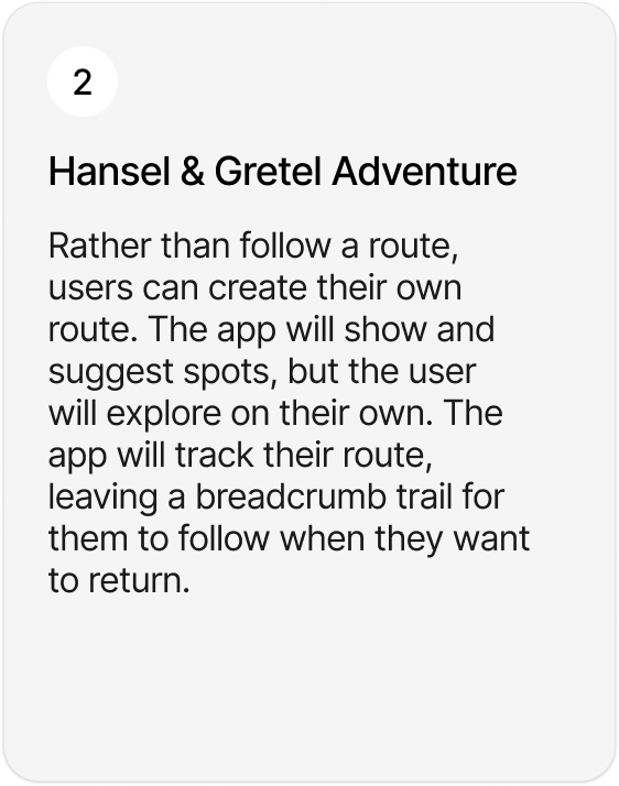
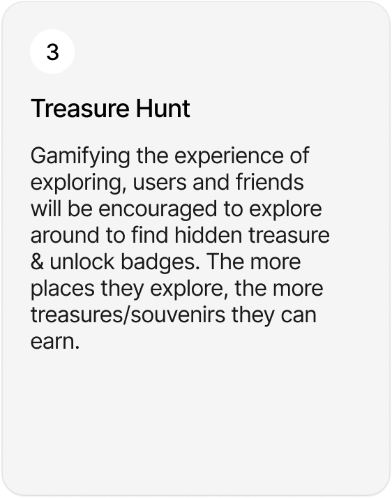
Ultimately, after receiving some feedback from others, I decided to go with option two, and incorporate elements of one into it.
Paper Prototypes, Wireframes, and Usability Testing
Stage 2.1: Paper Prototypes
Stage 2.2: Usability Testing
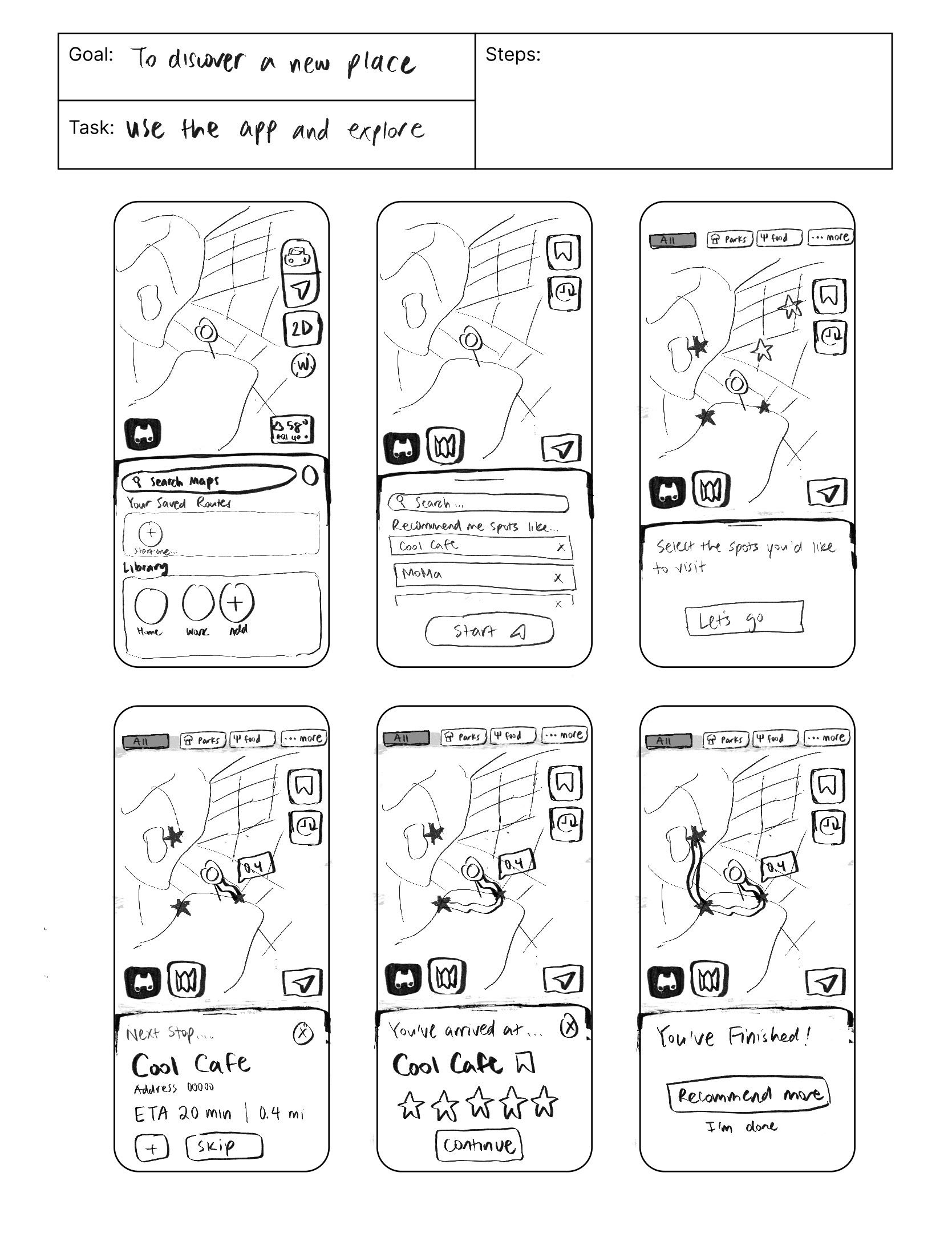
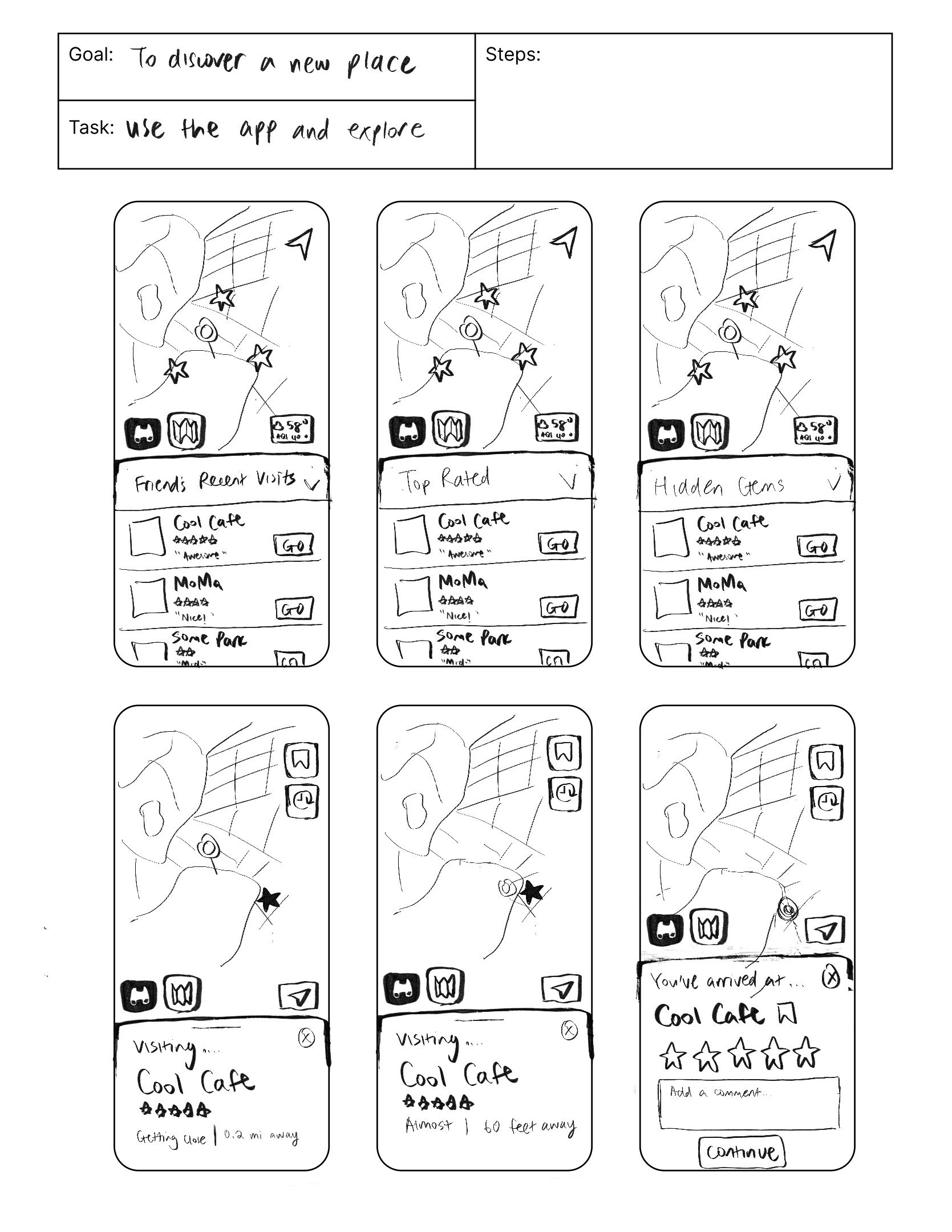
User Goal: to discover a new place
User Task: to use the app to explore places around you
User Flow:
Insights from Testing:
1
Apple Maps Homepage
Problem: The participant struggled to begin the experience because she didn’t know where to press to enter "explore mode". She was also confused by the idea of using Apple Maps to get “lost.” She thought that the compass was to help her see the current direction rather than as a way to enter “exploration” mode.
Solution: I would change the icon to something that shows "explore" more clearly and add an alternative, more visible option to enter explore mode.
2
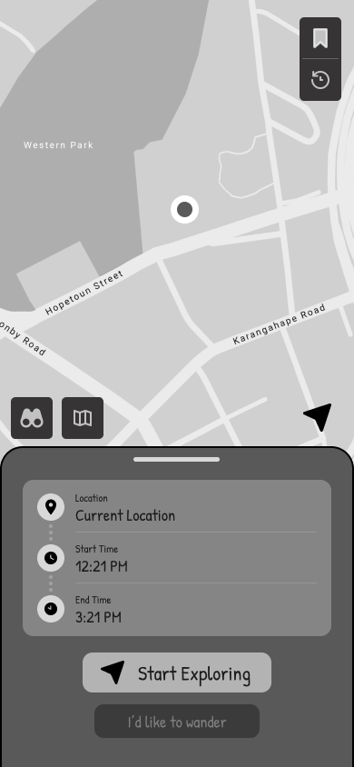
Explore Mode
Problem: The participant thought the icons to the start were very clear, but was confused on what the time meant, as she thought it represented the current time and the ETA to a destination.
Solution: I would add more labels or placeholders to help show users that the boxes represent the start and end time to the experience.
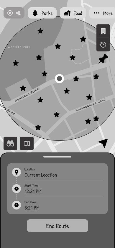
3
Route Screen
Problem: The participant thought that stars were very clearly clickable and correctly assumed where it would lead, but felt that the stars were not distinctive from each other.
Solution: I would perhaps add some color coding to the stars to help make the bunches of stars distinctive from each other (e.g. when a location has been visited versus not visited).
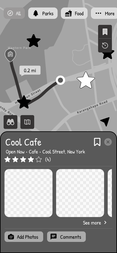
4
Location Modal
Problem: The participant thought that the layout was easy to navigate as it reminded her of Google Maps. However, she was confused on the breadcrumb trail system, and initially thought that the “route” was showing the direction to get to a star.
Solution: I would make it more obvious from the start that the route is being tracked as the user moves around. Perhaps I could add and highlight the different locations a user visits during their journey.
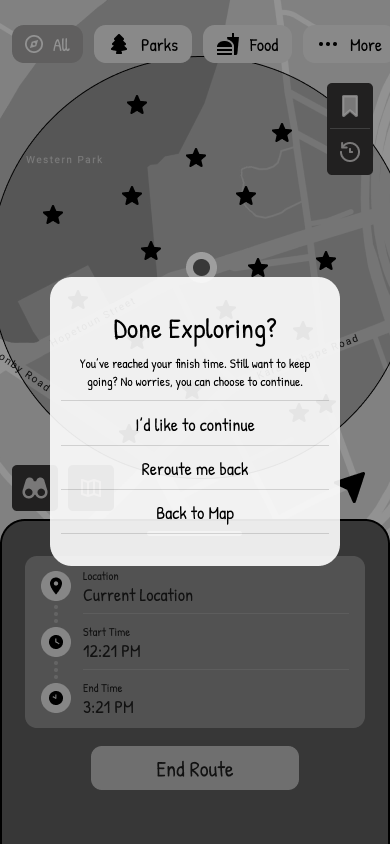
5
End Route Alert
Problem: The participant thought that the “15 more minutes” and “I’d like to wander” options were confusing, and didn’t know what each option was supposed to do.
Solution: I would either make the options more descriptive, or simply scrap both and combine it into a “continue exploration” option, and give users more freedom on how much longer they would like to explore after they select this.
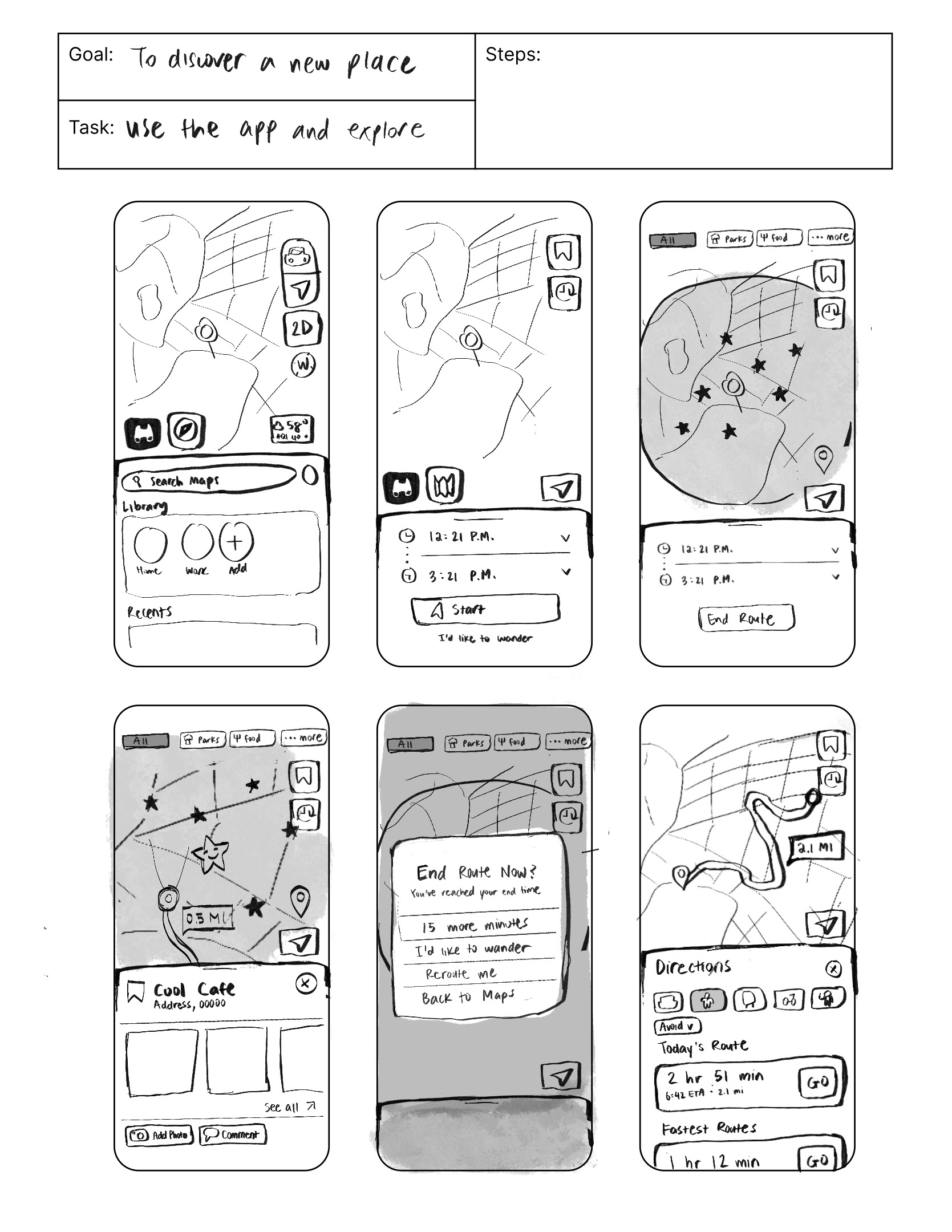
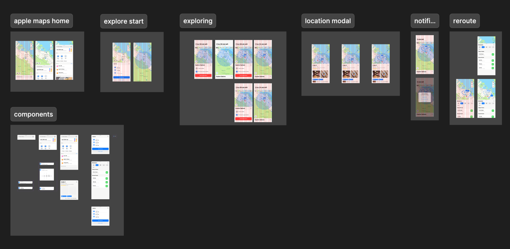
Stage 2.3: Final Digital Wireframes
(and another round of usability testing)
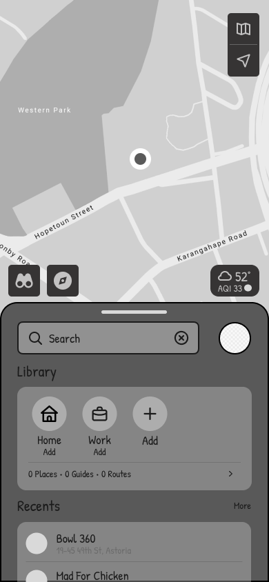

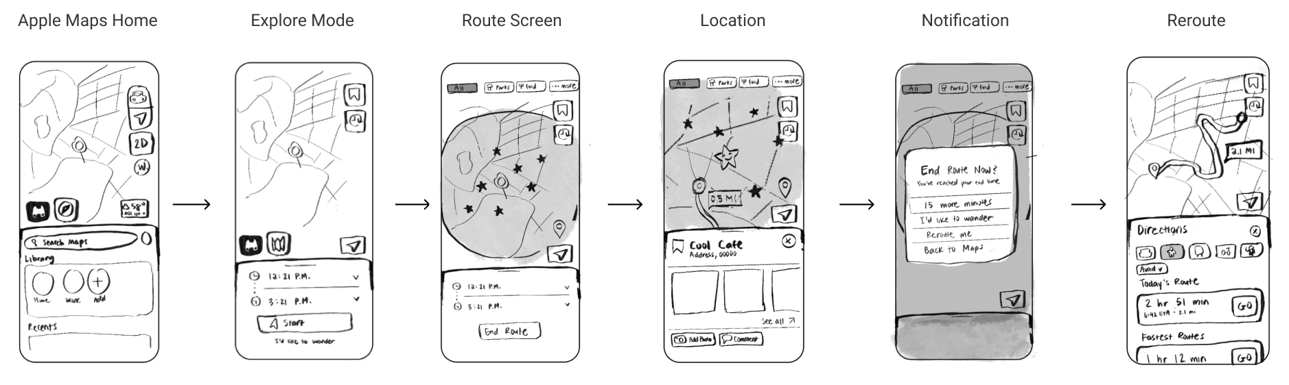
Final Prototype Demo
Takeaways & Future Goals
If I had more time or if I were to continue working on this project, I would expand more into the social aspect of "explore" mode, particularly the share, comment, and drop-a-pin features. I would also do more usability tests and iterate based on feedback, especially for the breadcrumb trail feature, which in its current state may not be the most self-explanatory.
Throughout this project, however, I learned a lot about the UX research process and rapid design development. I gained hands-on experience with planning and conducting interviews, synthesizing insights into user personas, and using those findings to inform design decisions. Working within tight time constraints pushed me to prioritize the most impactful features and iterate quickly based on feedback. I hope to bring what I've learned in this project into my future endeavors! Thanks for sticking around :)