Noodle Village: A Brand Redesigned
Graphic Design
Overview: Noodle Village is a long-standing Cantonese restaurant located in the heart of NYC's Chinatown. In their efforts to expand and increase locations, they wanted to do a complete brand redesign, based around a porcelain theme. They hoped to modernize their restaurant while keeping core traditional themes and motifs.
Responsibilities: Finalize prototypes for a new logo and a new menu
Timeline: 6 weeks
Tools: Adobe Illustrator, Adobe Photoshop
THE LOGO
Inspirations


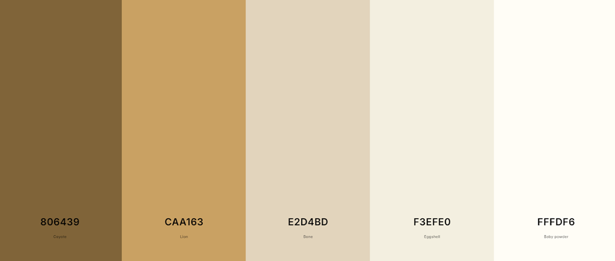
Color Palette
Designs
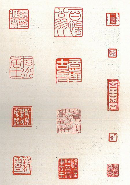
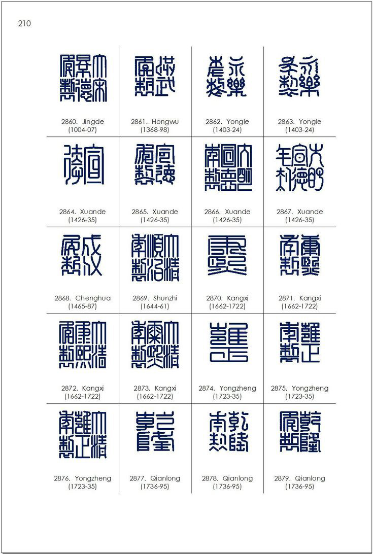
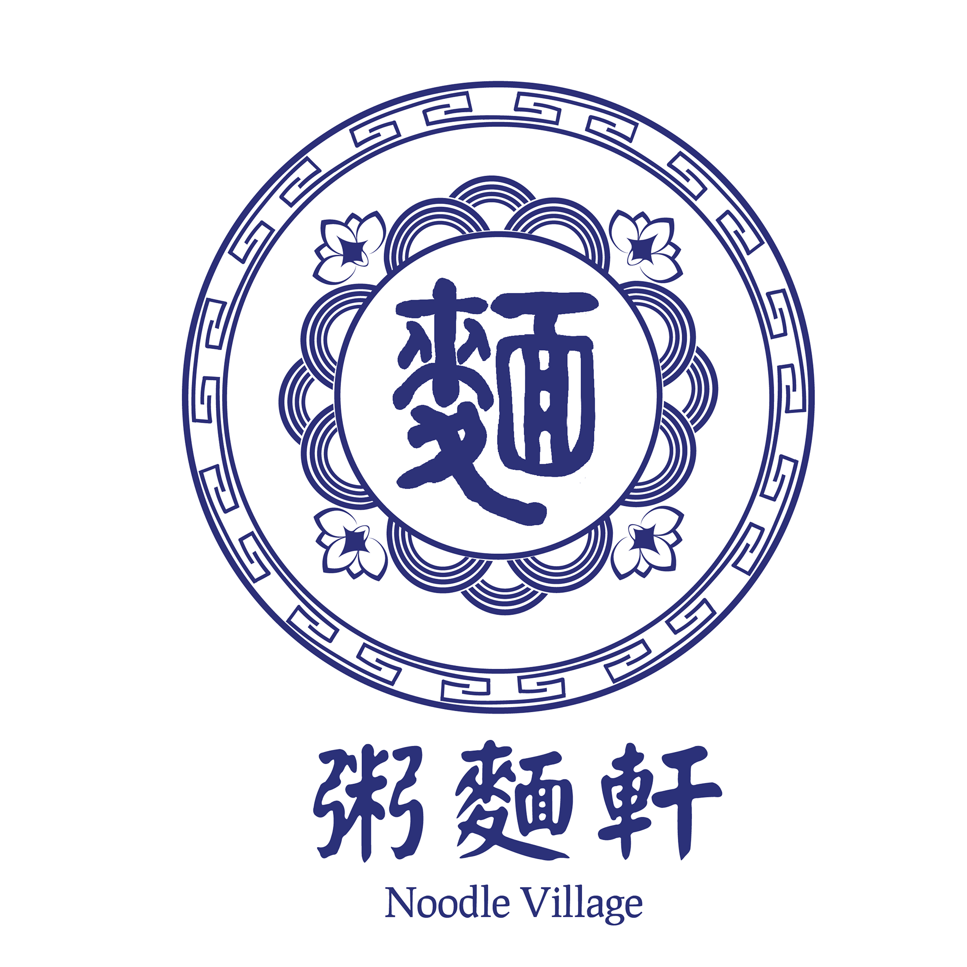
While designing this logo, I was inspired by traditional porcelain stamps. The most important factor I had to consider while designing this logo was the typeface that I was using to implement the name into the logo: a traditional-styled typeface that imitated brush strokes. I made sure to maintain a brush-stroke feel all around the logo, from the border to the typeface.
After review, this logo was rejected and instead decided to be used as a stamp as well as an add-on that can be used in other designs.
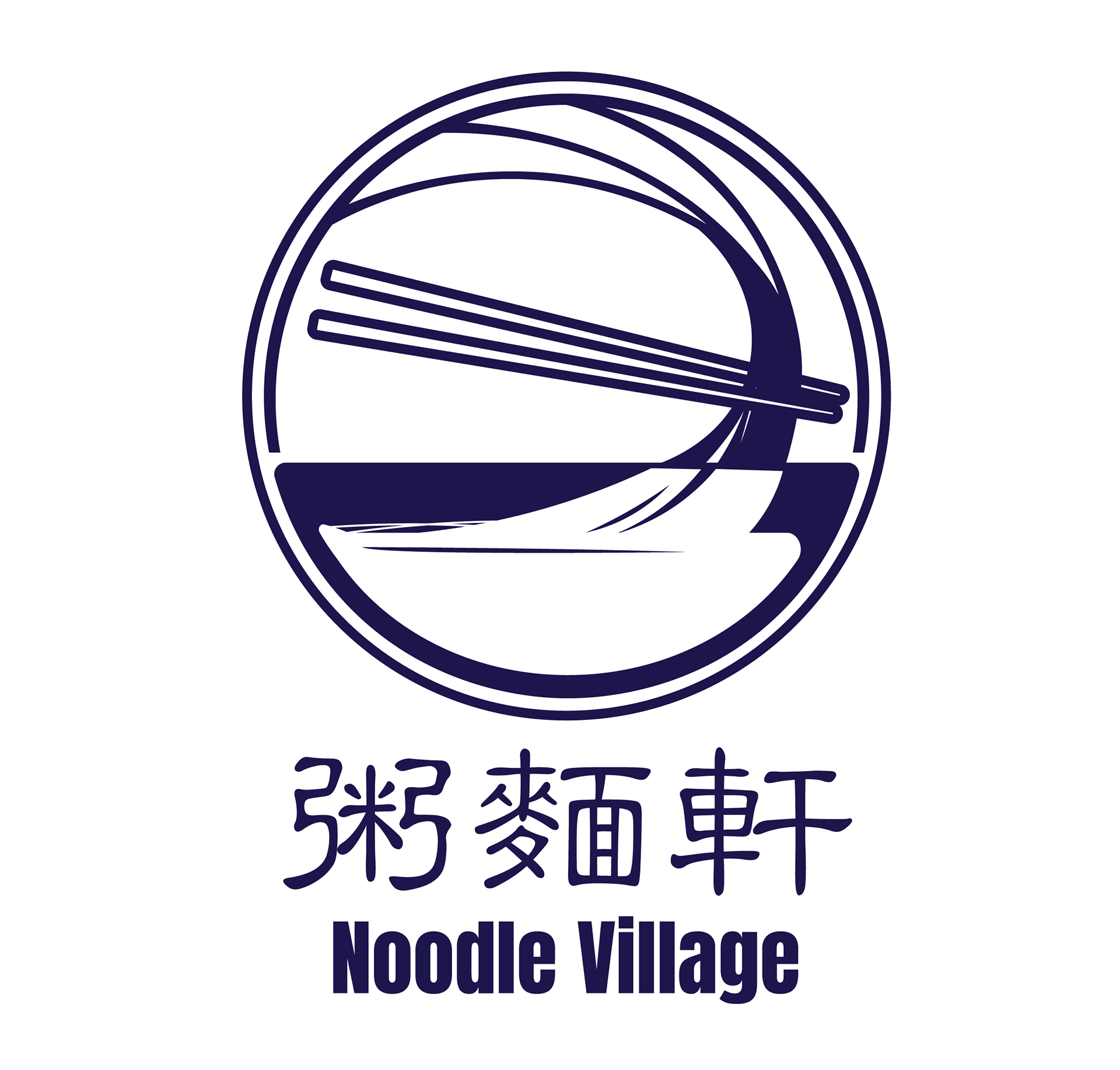
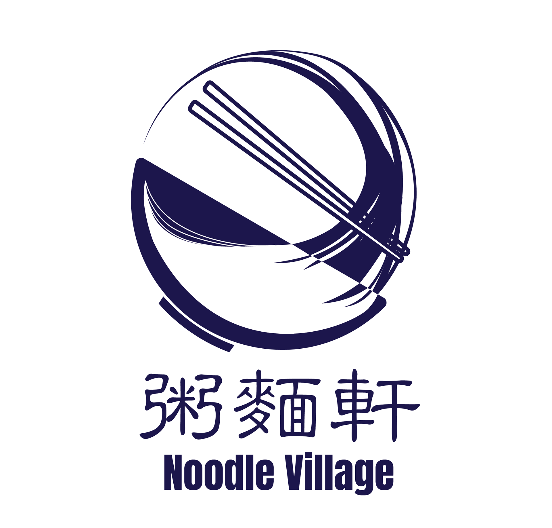
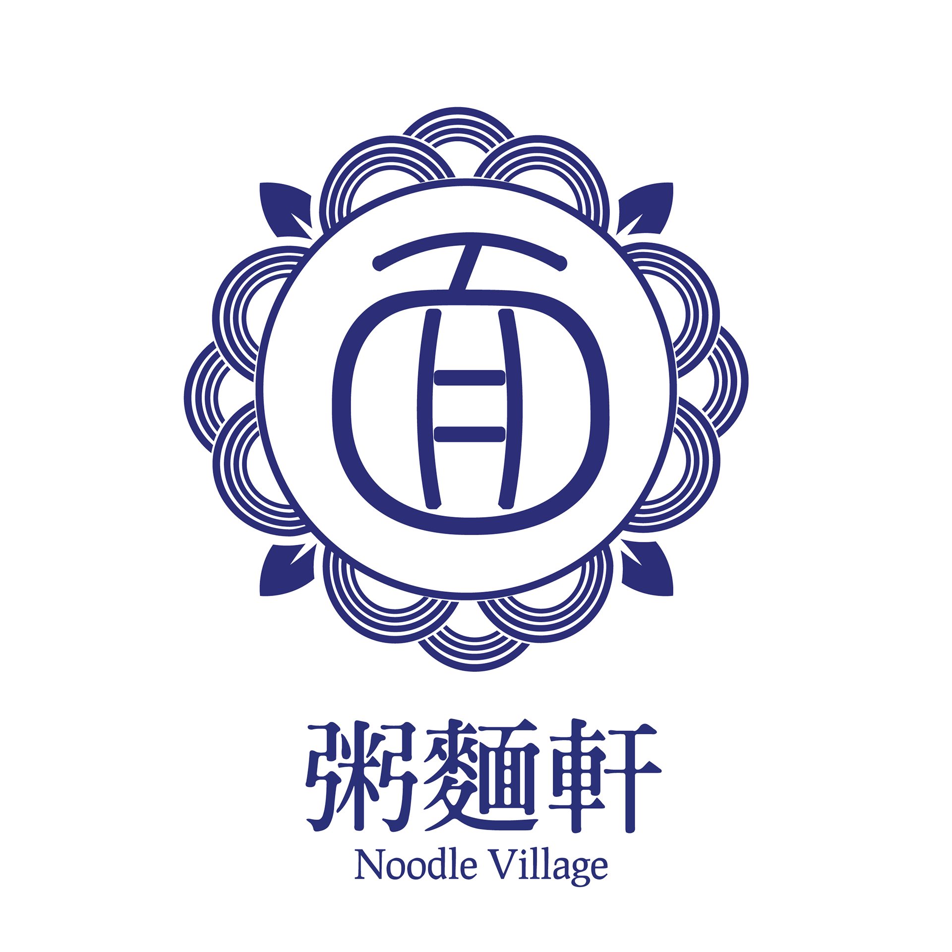
In an effort to design a more modernized, broad take of noodle village, I utilized negative space and curved lines to imitate noodles in a bowl. With feedback, I improved the second iteration by removing the border and adding more rhythm to remove the sense of stiffness.
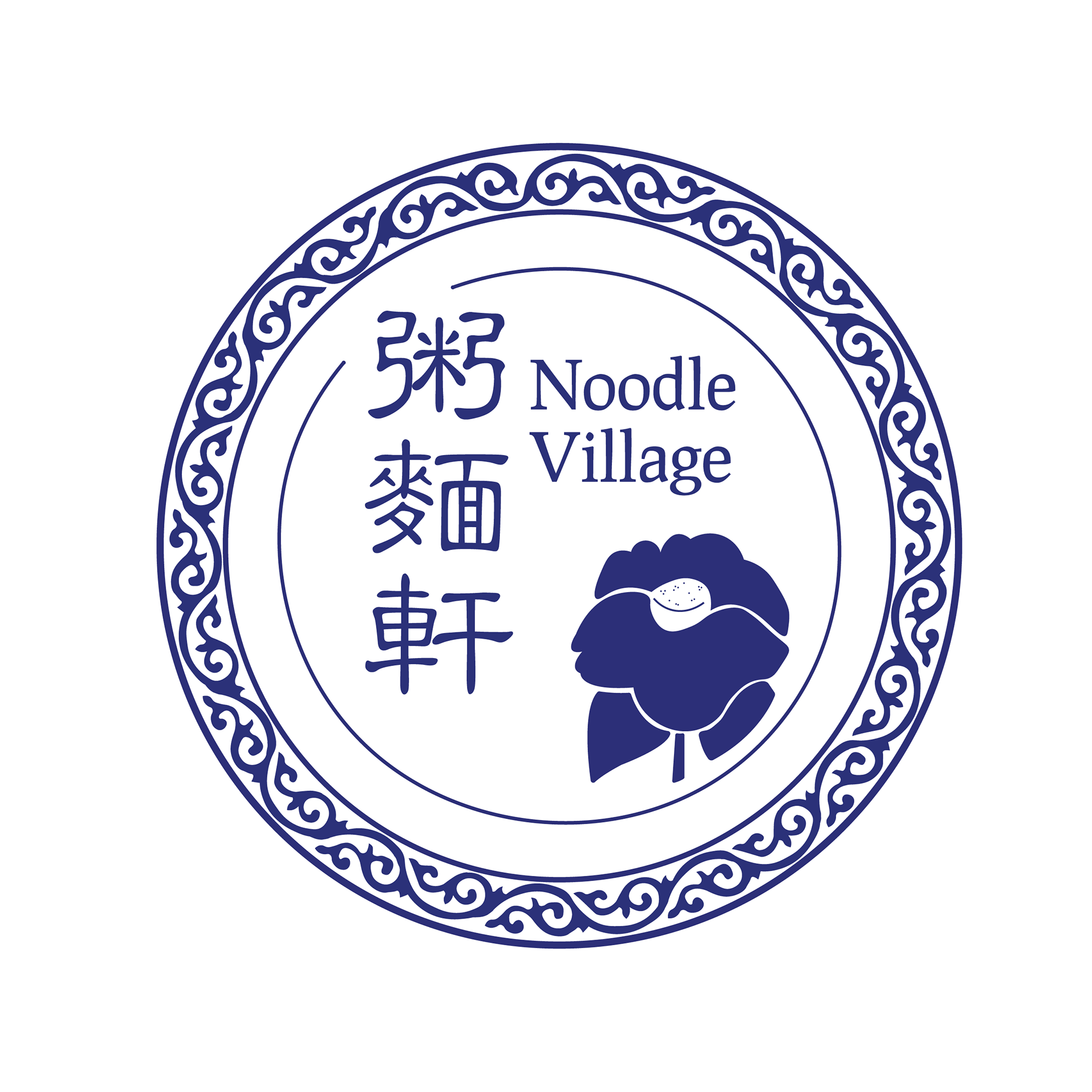
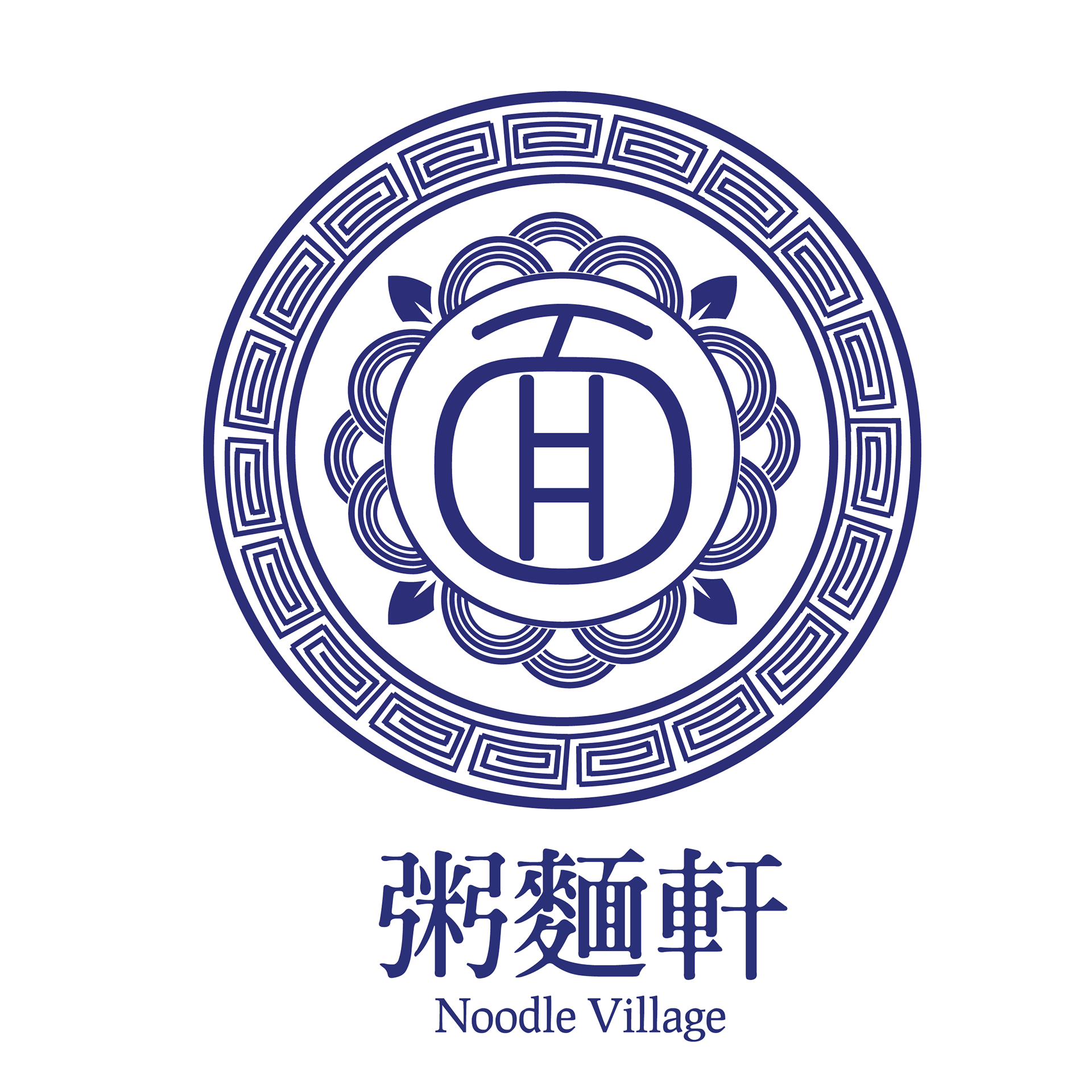
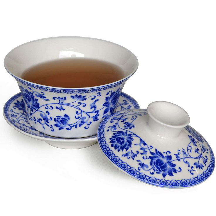
Following the porcelain theme, I was inspired by old Chinese porcelain, and took note of similar qualities on them: borders, flowers, dragons, and other intricate designs. I made several renditions of a border with these elements, specifically border and leaves. I also incorporated a semi-circle pattern that imitates the shape of noodles. In the center, I added the Chinese letter for "noodle," done in Illustrator for a handwritten stroke image.
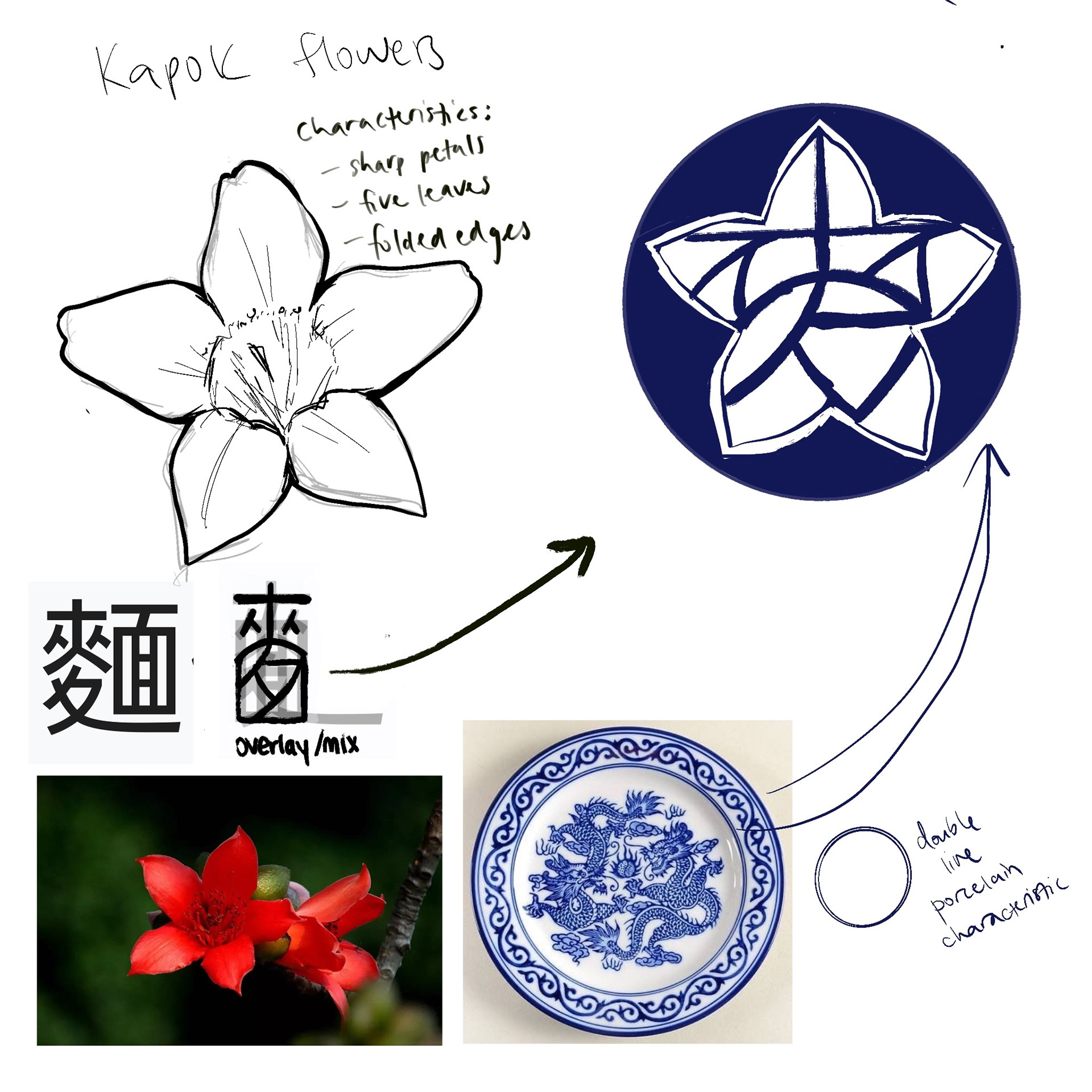
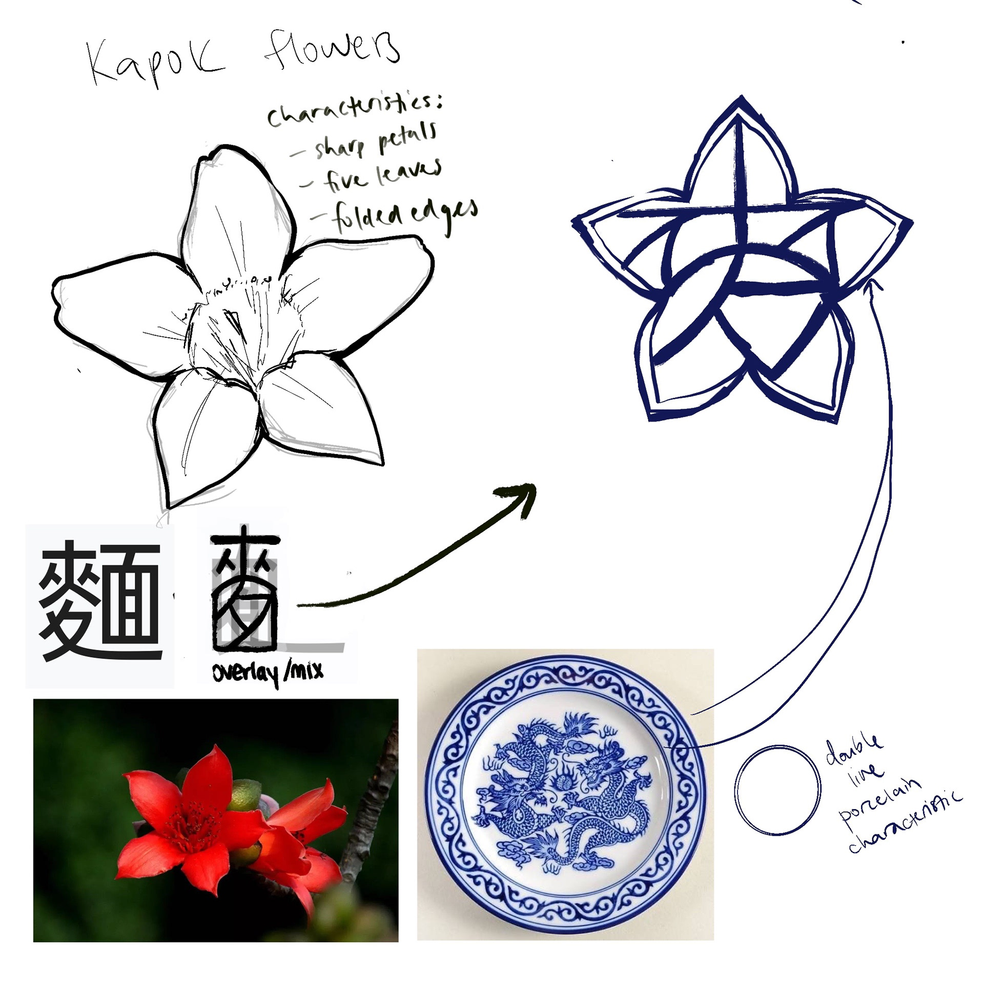
Inspired by the official flower of Guangzhou—the Kapok flower—I designed a logo around this flower. I noted the main characteristics that stood out, specifically, the frayed edges and rounded petals. I overlayed the parts that make up the traditional Chinese character for "noodle," and inserted it into the flower to make the logo. I wanted to create a sleek design that still had traditional, cultural elements behind it's design.
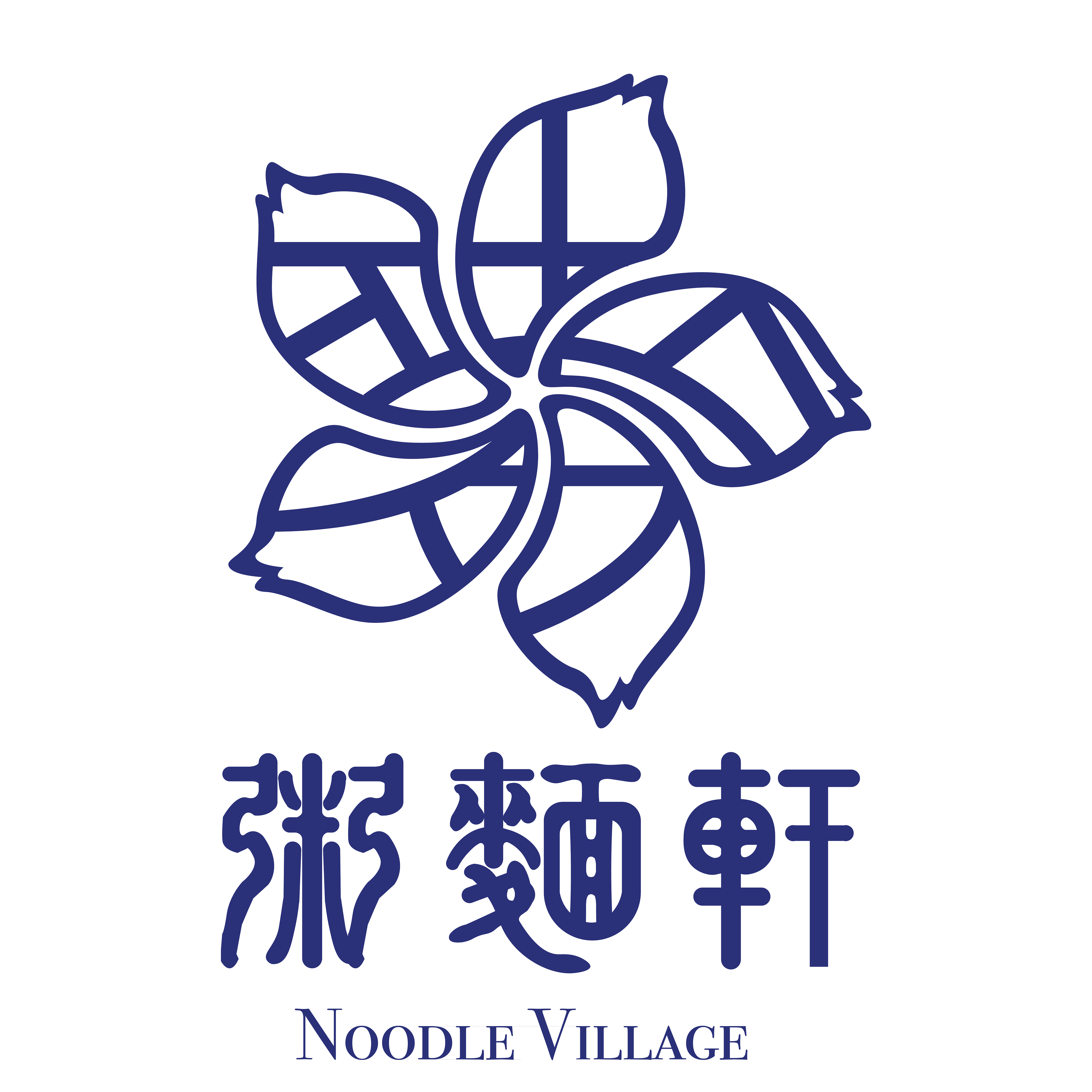
In my second rendition, I decided to base the logo around the official flower of Hong Kong—the Bauhinia x Blakeana flower—which also had frayed edges, thin petals, and curved petals. Similarly, I overlayed the same character into the flower.

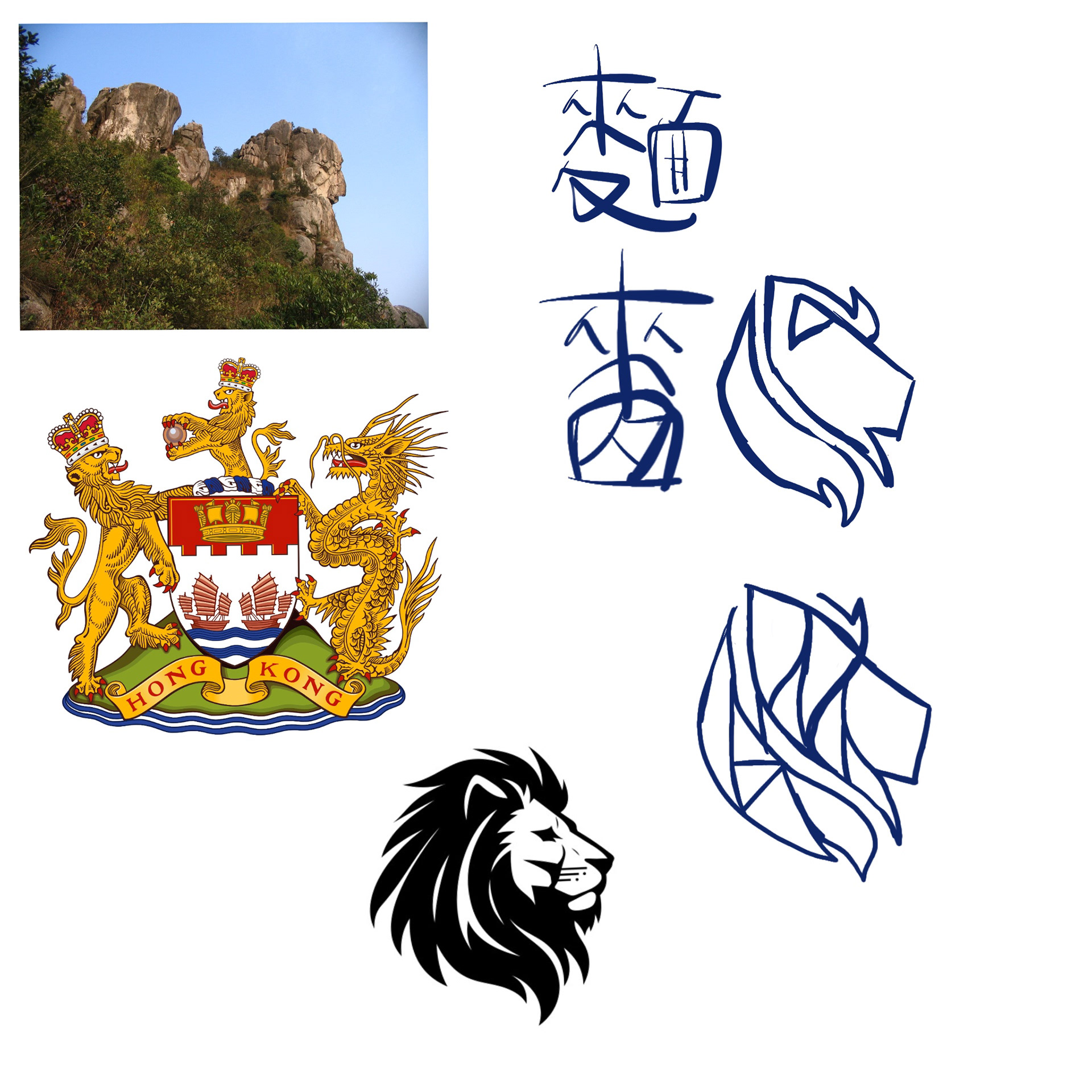
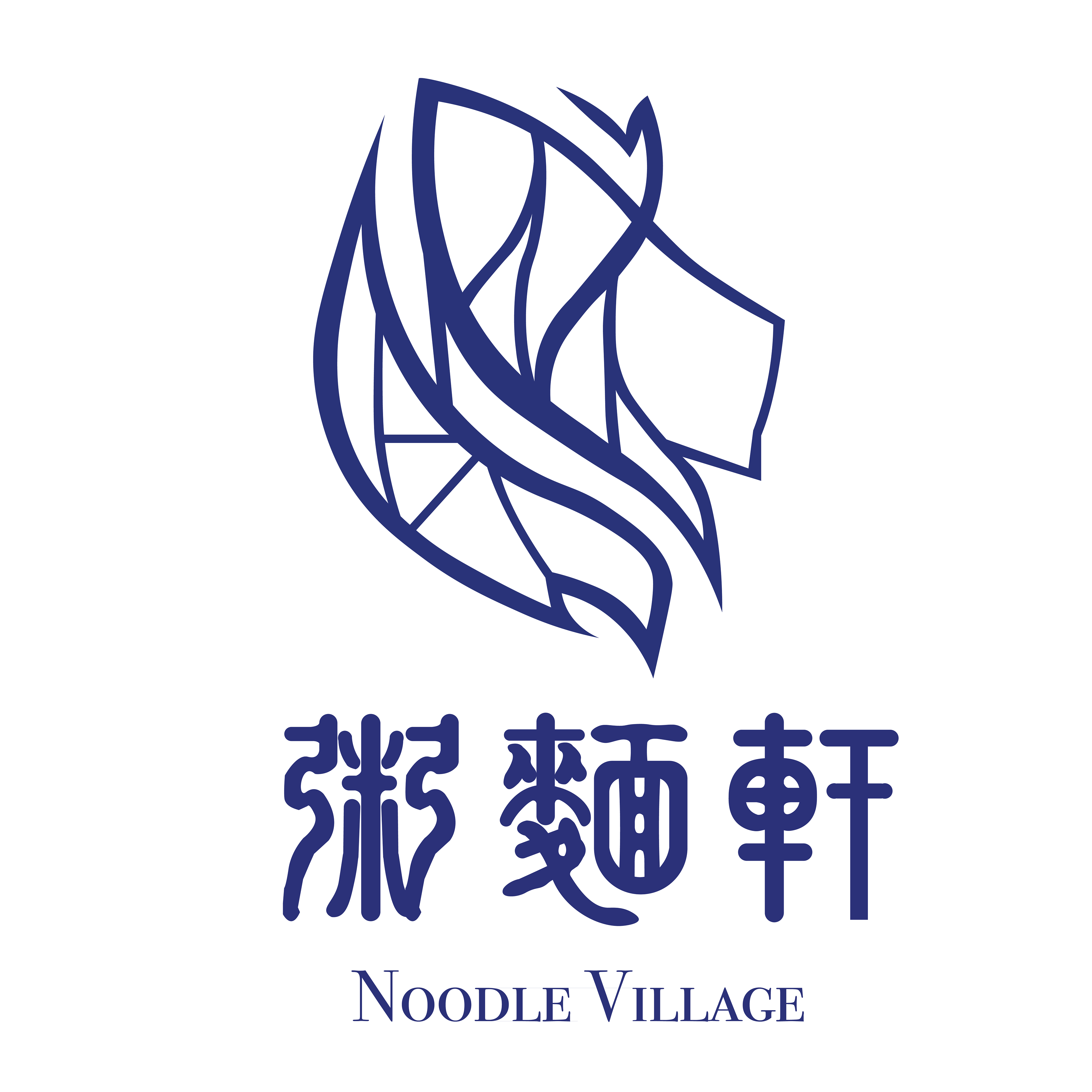
For this logo, I was inspired by Lion Rock, a cultural landmark of Hong Kong. Lions are a big part of Hong Kong history, also seen in the old crest of Hong Kong. I incorporated the same character from the flower into the lion. At first I was unsure how to go about it, but decided to curve the letters and overlay the character into the lion's mane for an abstract look.
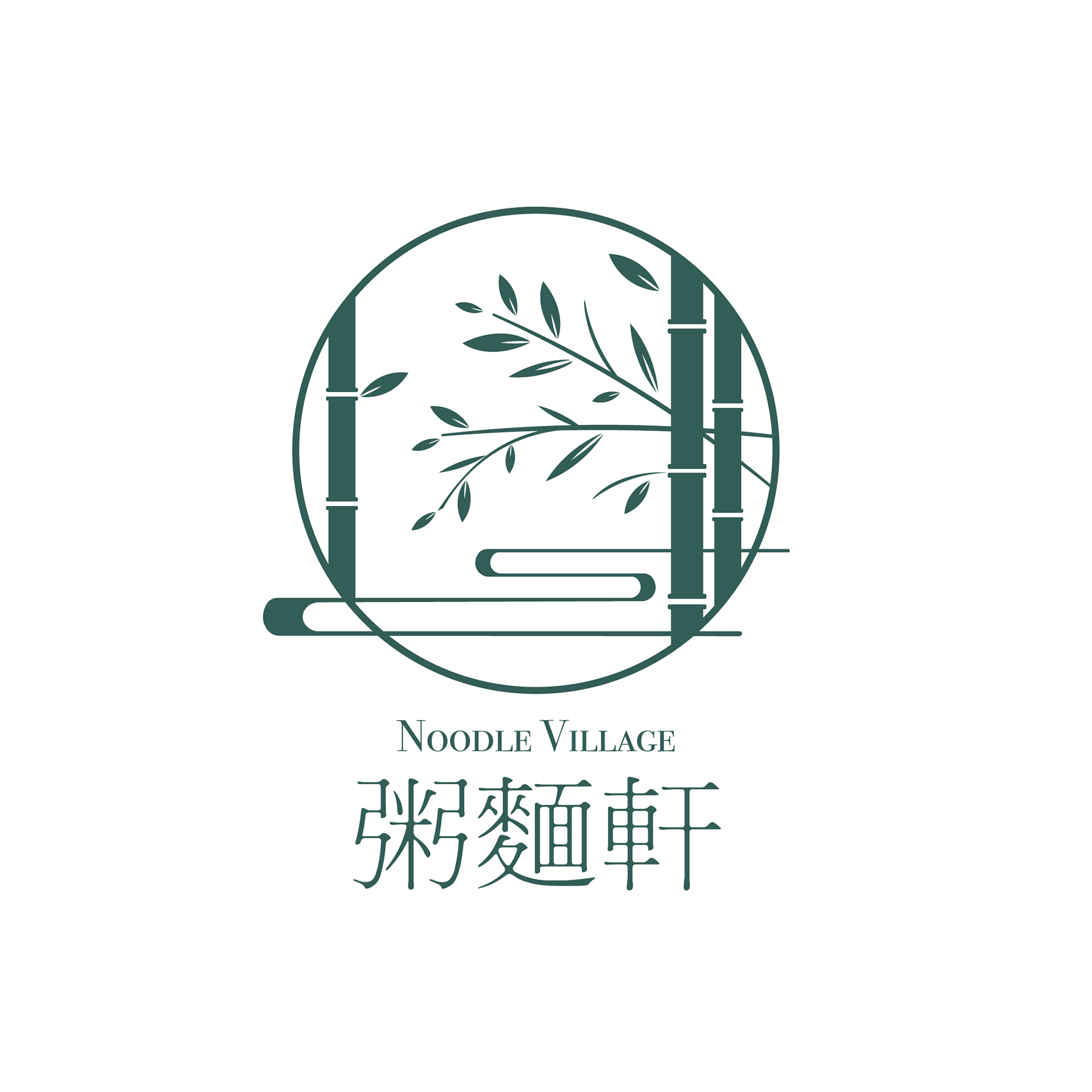
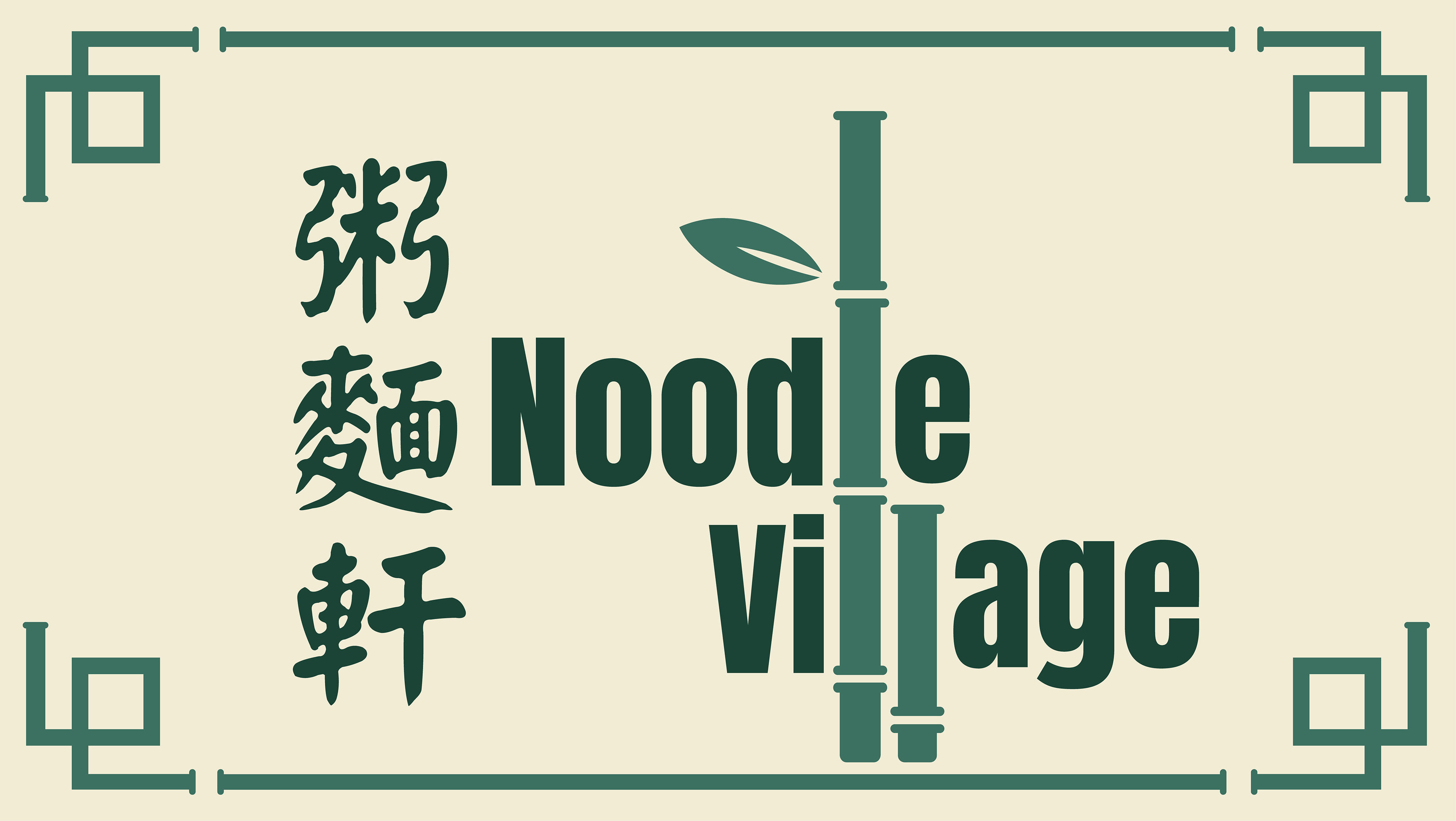
Finally, I decided to make another logo inspired by bamboos, which are also commonly seen around traditional Chinese settings. I wanted a logo with a sleek, modern design and decided on a logo that imitates a window view of bamboos.
Accompanying this logo, I also created a graphic of the same theme.
THE MENU
Inspirations
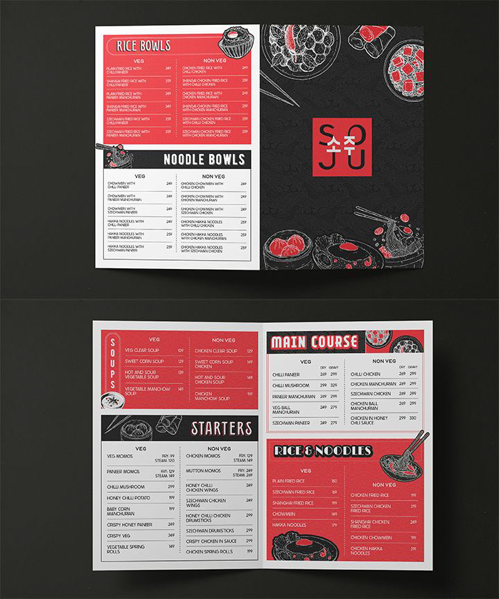
Version One: In-Store Menu
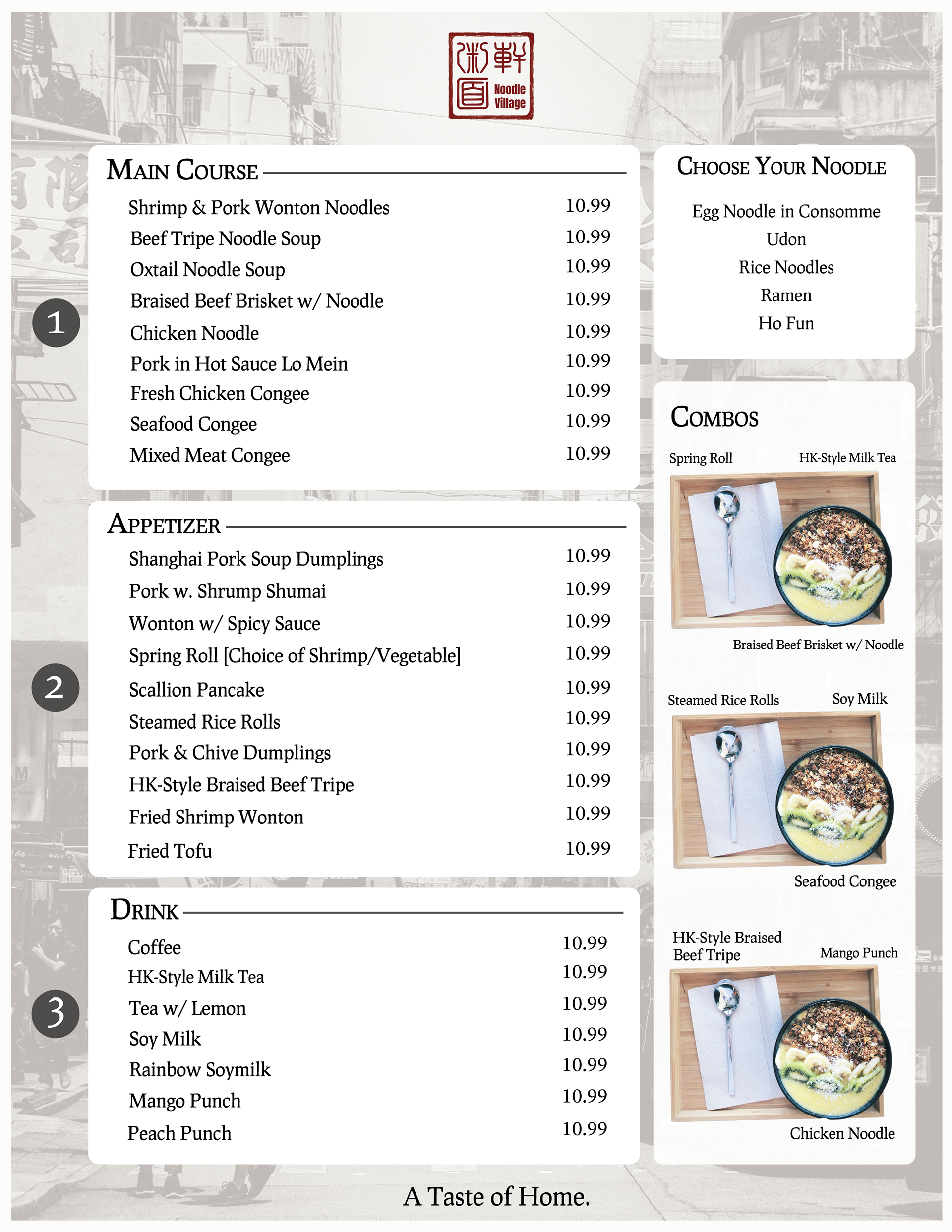
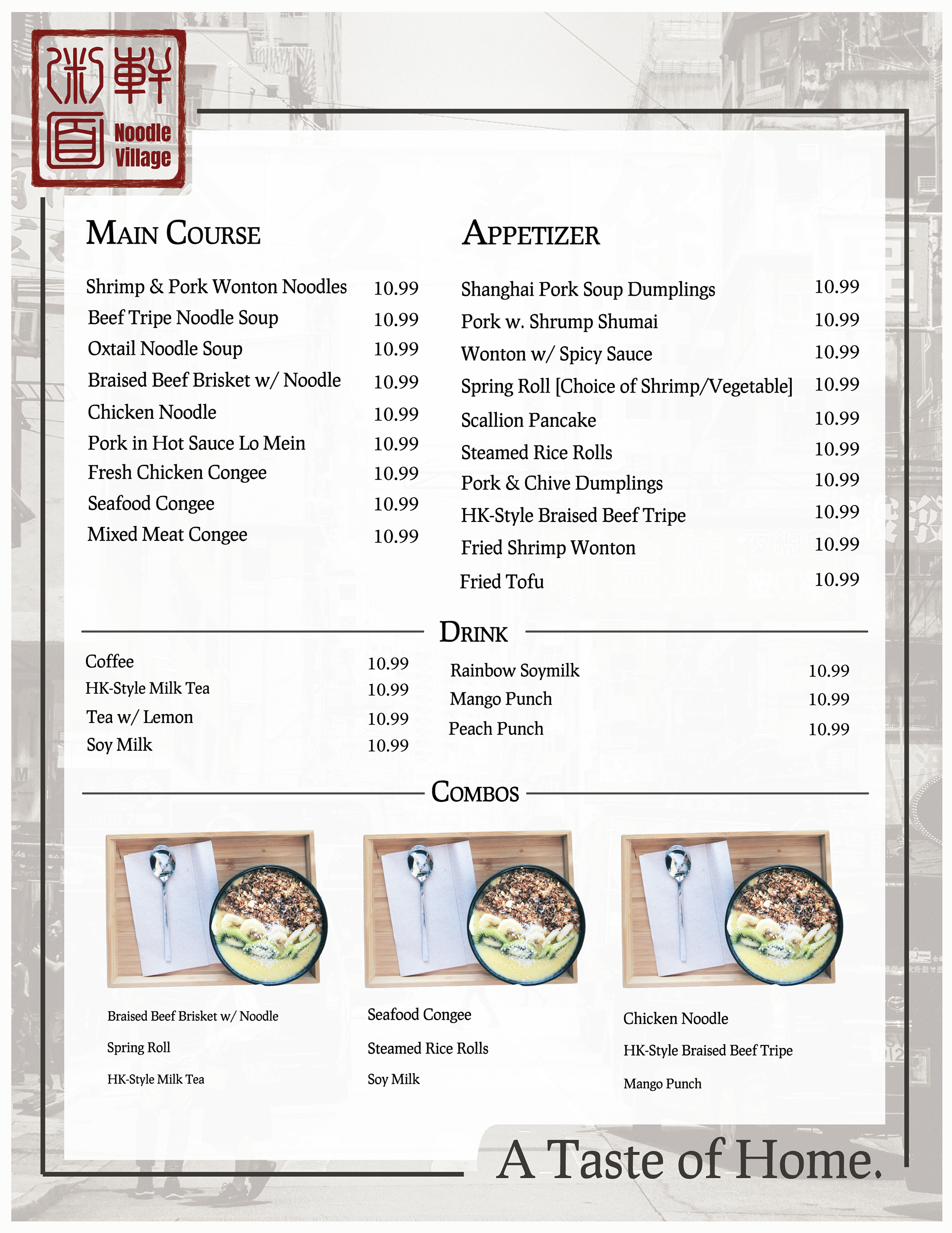
The client requested to keep the old Hong Kong street imagery from the current menu and site design. I decided to use this imagery as part of the menu background, lowering the opacity for a faded look. These two renditions of the menu represent a one-sided menu, where the back would simply be a cover page with the store's information and details. The current menu was too packed, and so the client requested that the new menu cut down on the number of items. I highlighted the main sections of the current menu and added a couple placeholder visuals to prevent the menu from being too overwhelmingly packed with words.
Version Two: Brochure Menu
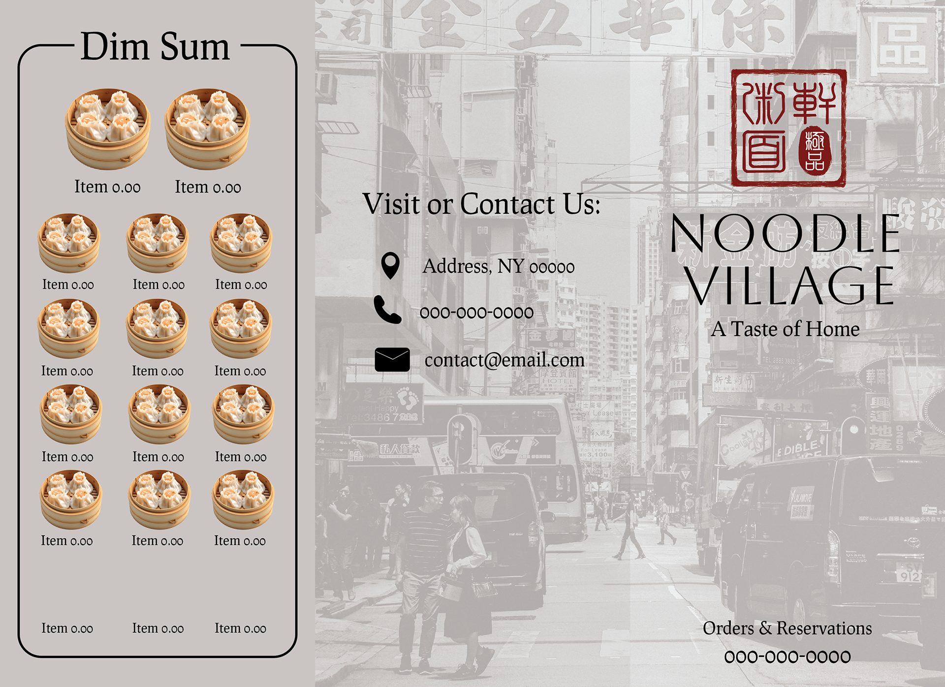
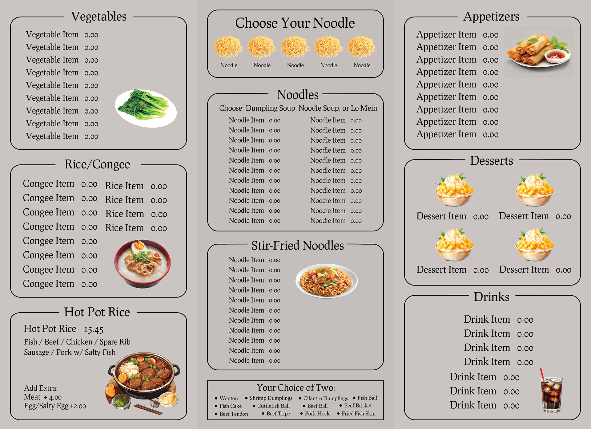
This menu represents a take-out brochure menu, one that customers can grab and go with. The left graphic represents one side containing the front and back of the brochure, and the right graphic contains the other side with most of the menu information. Similar to the in-house menu, I kept the old Hong Kong imagery in the front and back of the brochure, making sure that the two align to create one larger image. I sprinkled in placeholder graphics around the brochure to make the brochure more colorful and inviting.
Takeaways
Working on graphic design for a Cantonese restaurant was a valuable experience that deepened my skills in Adobe Illustrator, refined my understanding of the design workflow, and gave me insight into Cantonese culture. Designing logos and menus required balancing aesthetic appeal with functionality, ensuring the visuals reflected the restaurant’s identity while maintaining clarity for customers. While I can see areas for improvement, this project reinforced the importance of iteration and feedback in design. Overall, it was a rewarding opportunity to apply my creativity in a real-world setting and grow as a designer.

